Leading on from Unit X, I wanted to research more about installation art and how textile and mixed media art is presented in different spaces.
Chiharu Shiota
Shiota's work has literal threads running through them, putting threads through the individual objects to literally connect them reminds me of a flow of electricity. The mix of the textiles and the mixed media objects means that the thread can loop around each piece in different ways that fit with the objects. These large scale installations are made bigger due to the threads used, however, they are still rooted in these small objects. Shiota's work in the first image includes the use of multiple levels, with the boxes creating shelving that sits at multiple heights. Within all of these installations, the colour scheme normally comprises of similar colours and could contribute to why the objects flow throughout the space, as well as the themes.
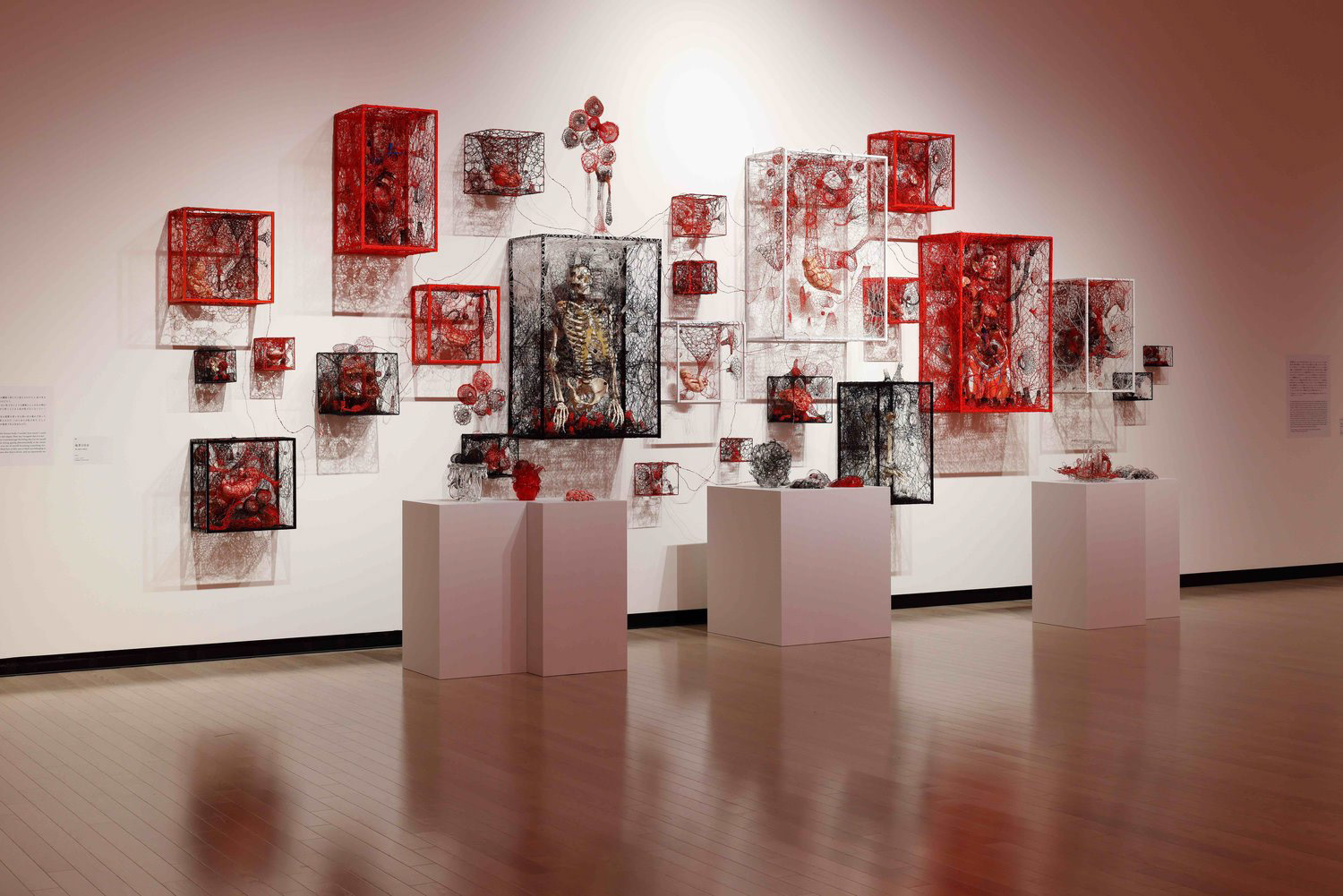
https://www.chiharu-shiota.com/the-self-in-others
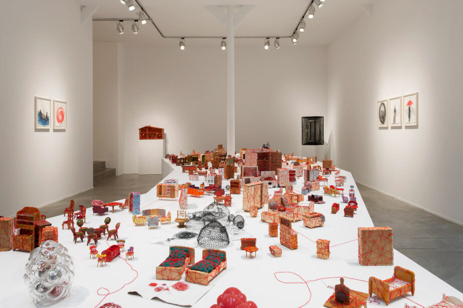
https://www.chiharu-shiota.com/living-inside-1
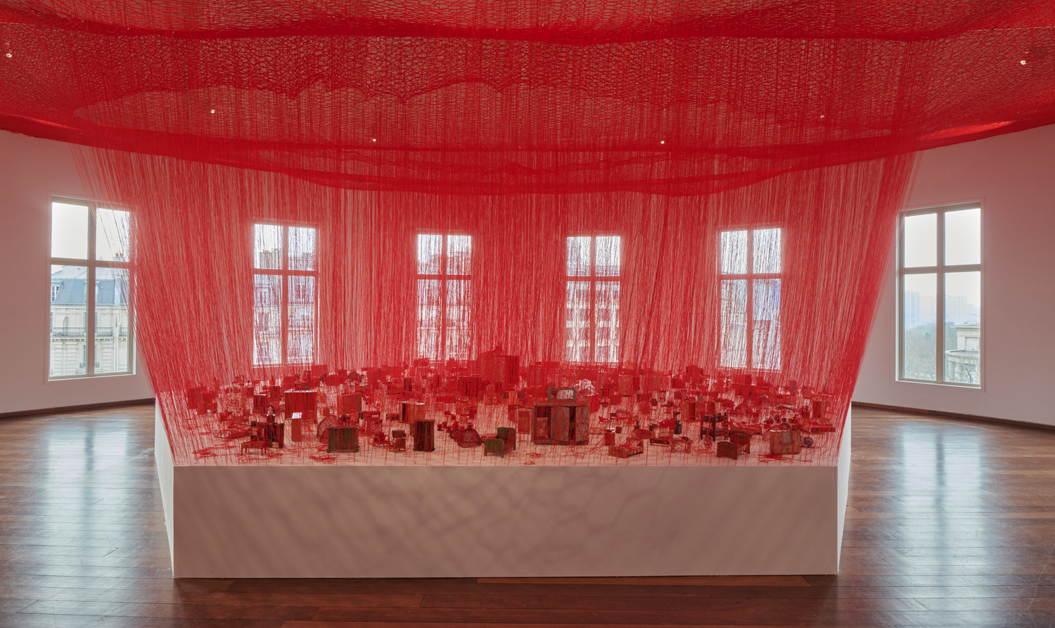
https://www.chiharu-shiota.com/carte-blanche
Although these pieces are small, it could be interesting to separate them out and see what happens when people walk amongst them, making them literally closer to the objects. The second image almost reminds me of a deconstructed house, creating a sense of home for some.
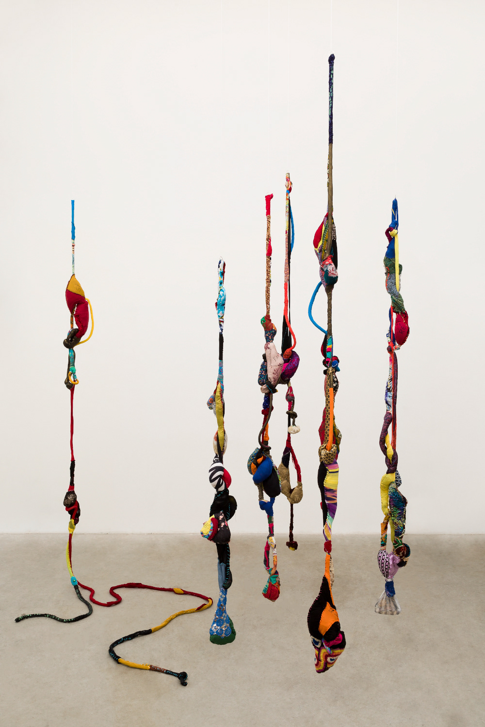
Sonia Gomes' work, as seen on the left, is inspired by her love for dance. Using a mix of used recycled fabric and laces, this work shows movement through the natural ways that the material hangs. The use of colour reflects the use of multiple fabrics and gives the effect of a collage. Although I can't see how far apart the singular pieces are, the use of space in between them emphasises the movement of each piece. I have not been able to find much on the work itself, but it looks like the work is hanging, this gives the illusion that the material is hanging above ground.
Within Sheila Hicks' work there is an emphasis on threads and weight. Each shape being weighed down in some way by the the textile it is full of. The large scale piece below in the left comprises of multiple threads hanging from the ceiling and pooling into the fibres that are below. The use of multiple colours emphasises the separate objects. Below on the right, there are multiple objects that are tightly bound, wrapped in the thread. Although you can tell these are separate objects, the use of colour creates variety within the work and there is also a variance in shape size.
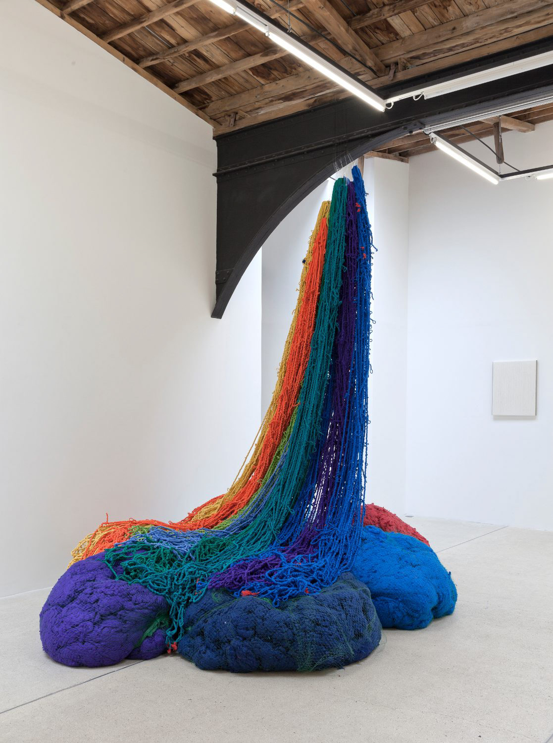
https://awarewomenartists.com/en/artiste/sheila-hicks/
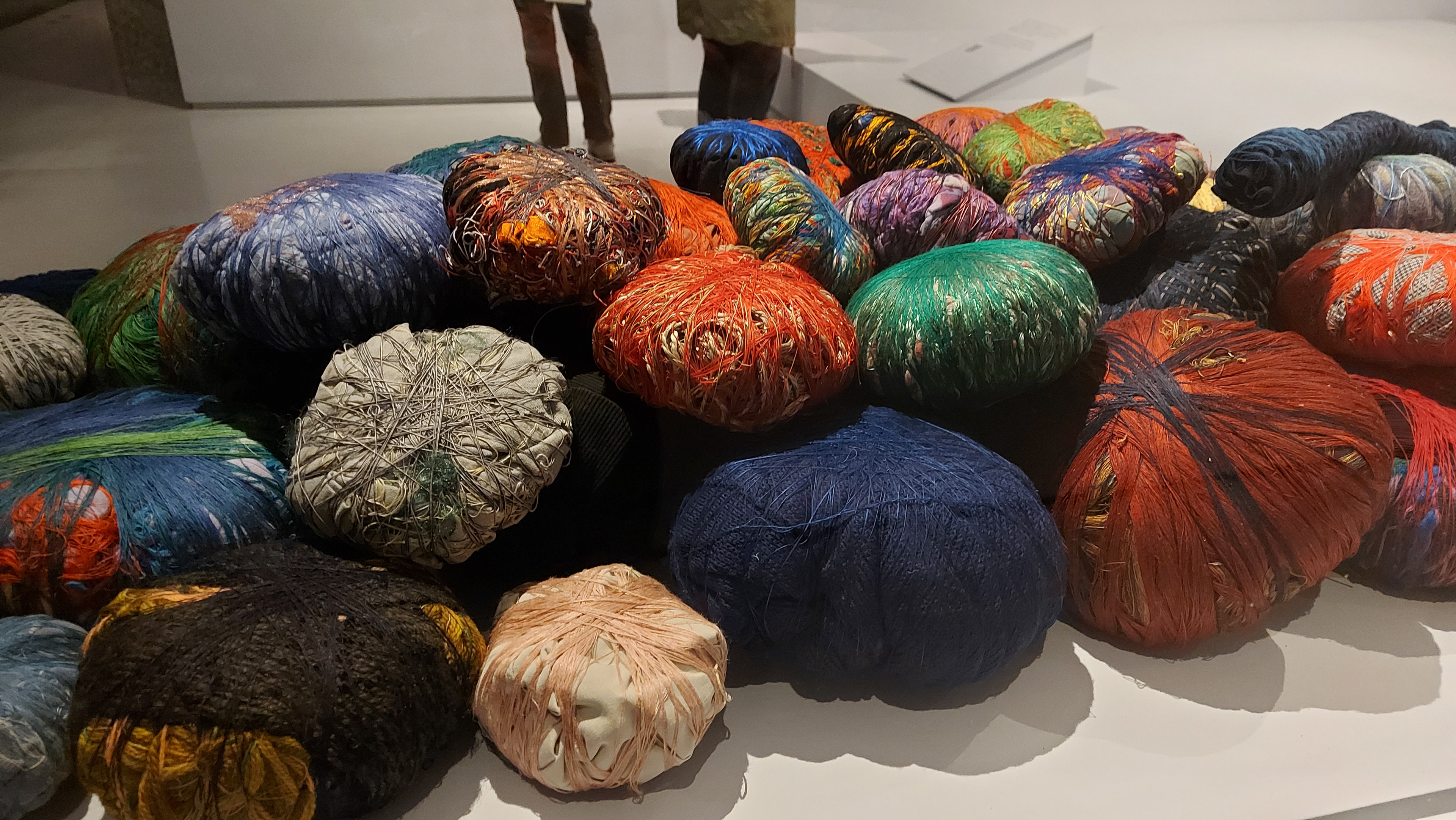
Own Photo from Unravel: Power and Politics in Textile Art
Ani O'Neill
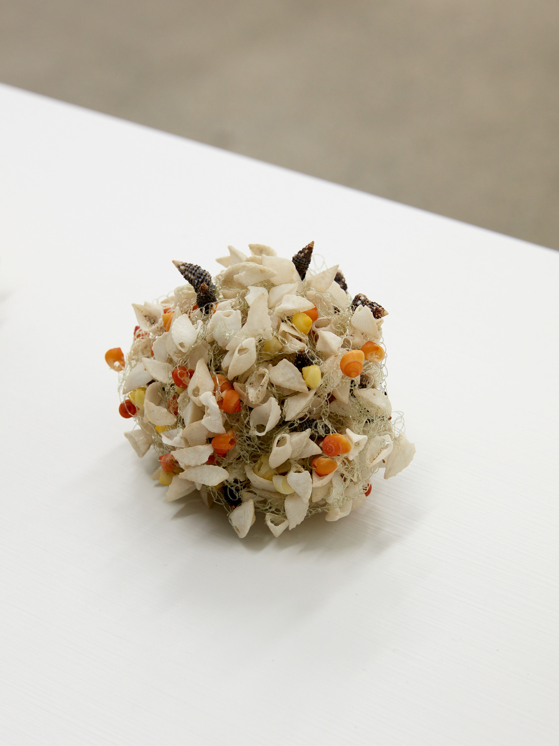
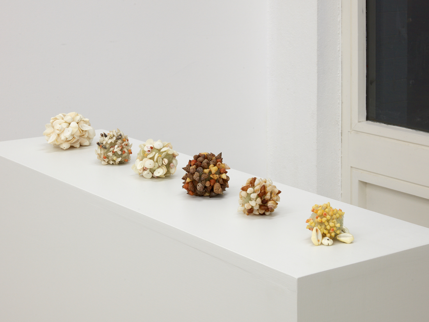
Using a mix of crocheted nylon and shells, the variety of shells are arranged in these ball like shapes and are displayed in a line so that you can see them from the front and back. Grouping these pieces together in a line shows the slight difference in size of each ball, compared to if they were all further apart. Looking up close in the bottom left photo, I can see the assemblage of the shells, the way that they all sit does look quite delicate, however, I'm sure the nylon crocheted between them increases the strength of them. I think to have these vertically presenting could be an interesting way of curating the work.
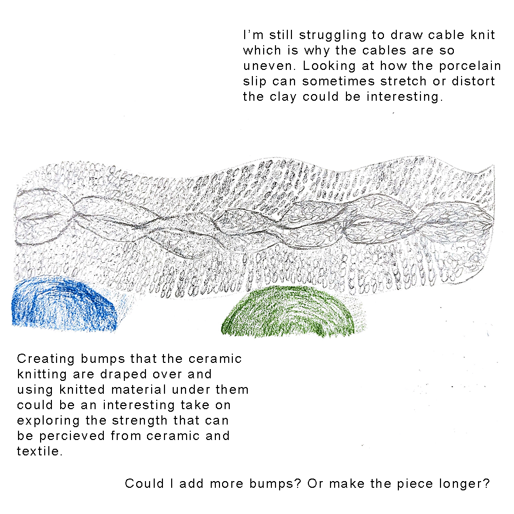
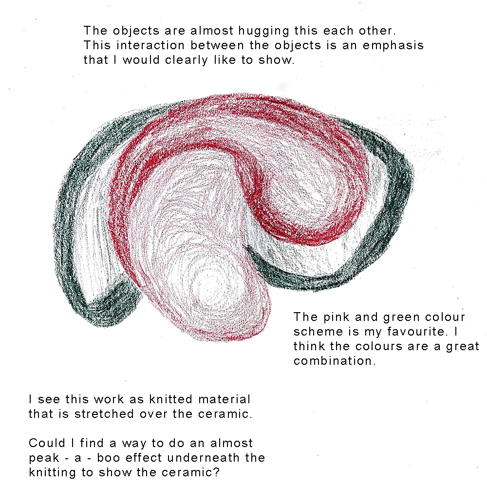
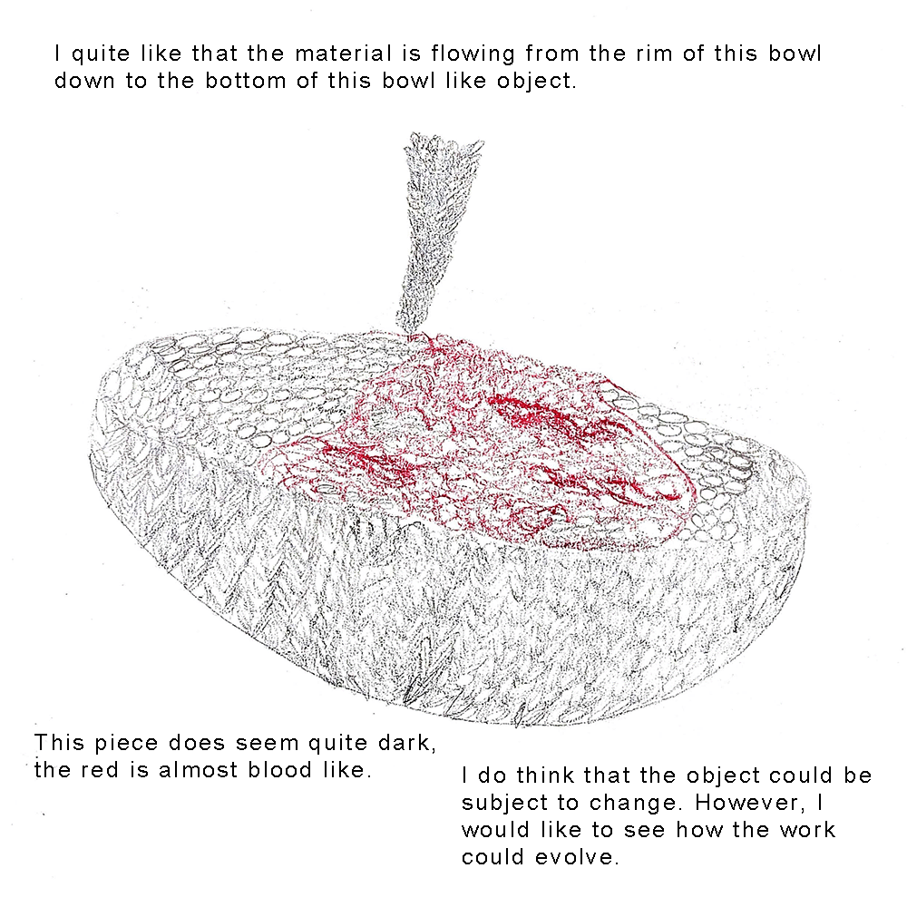
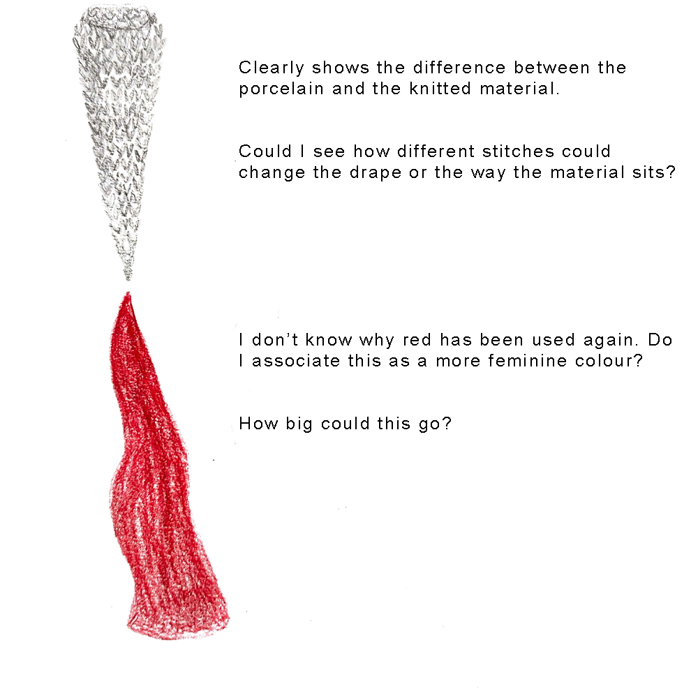
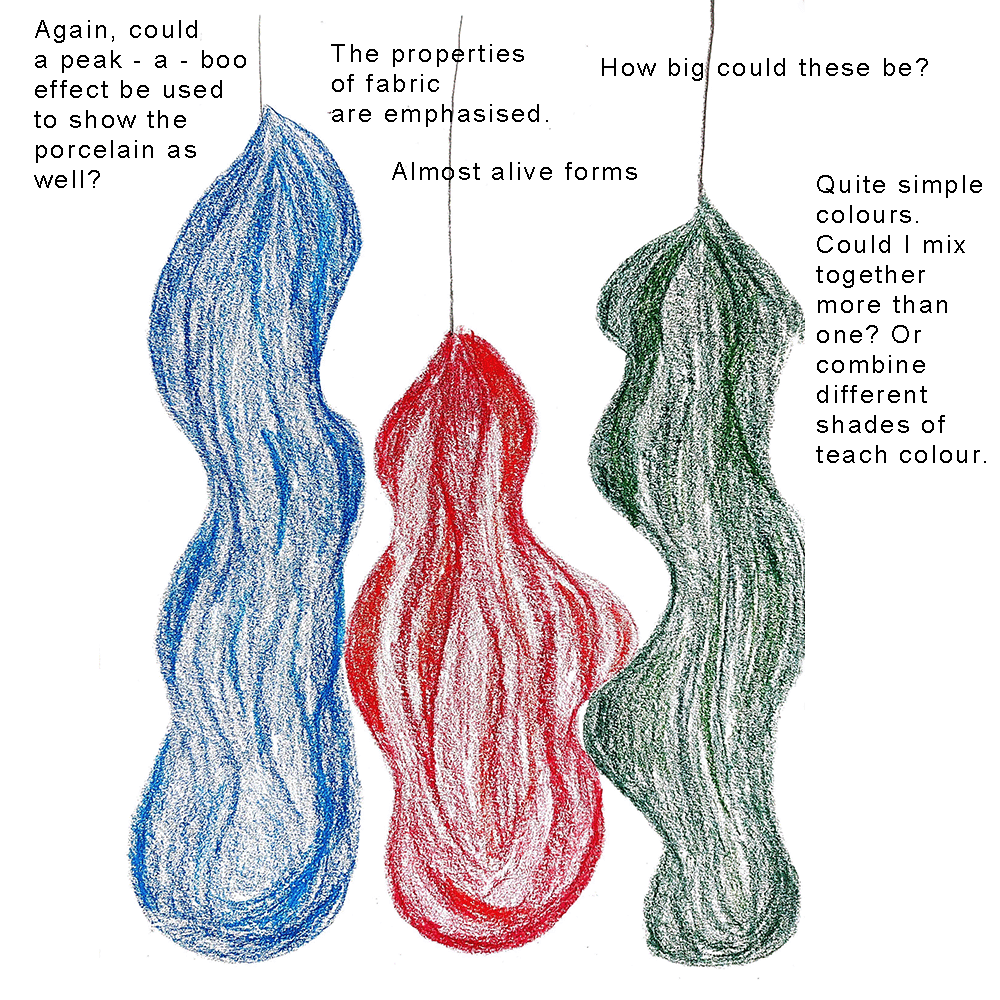
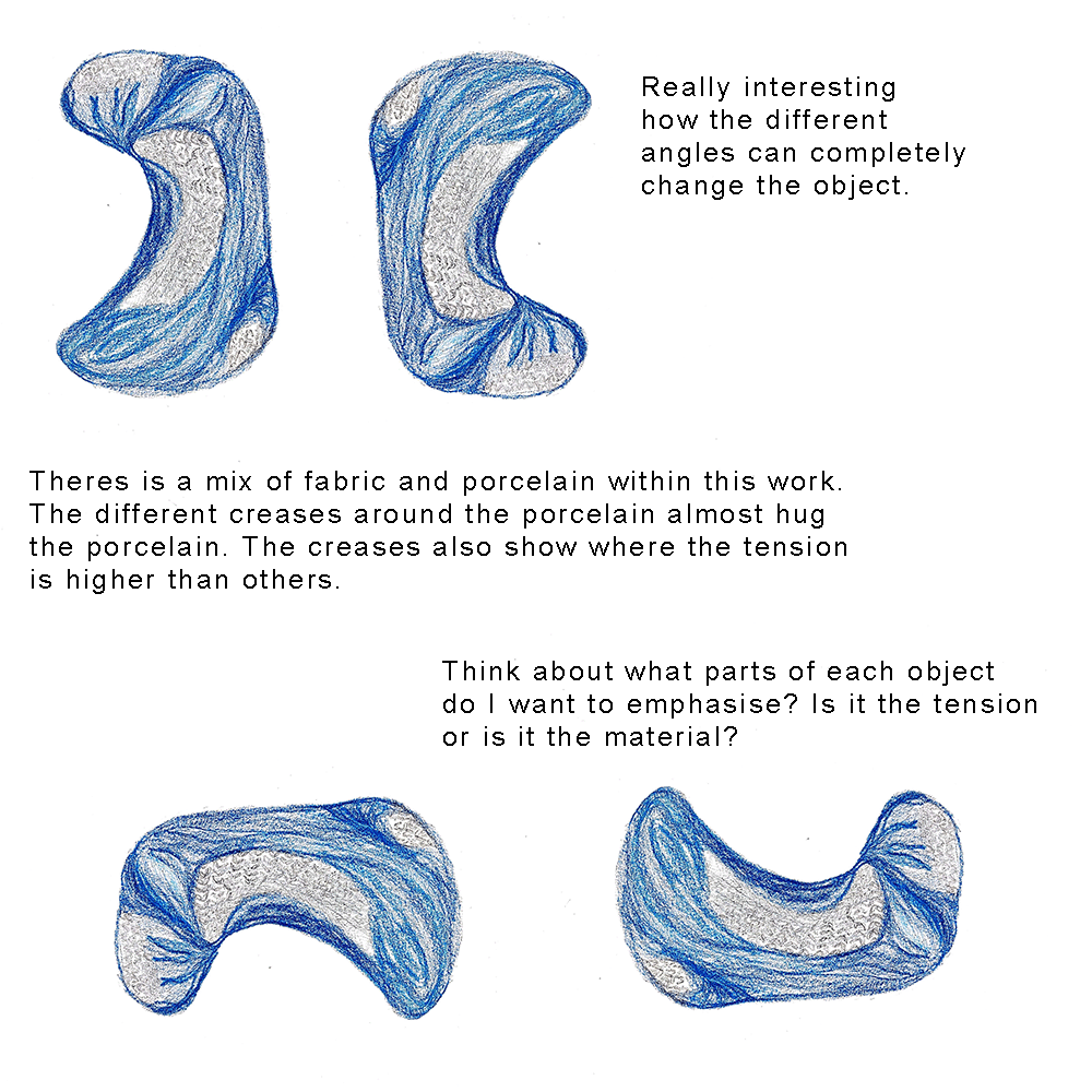
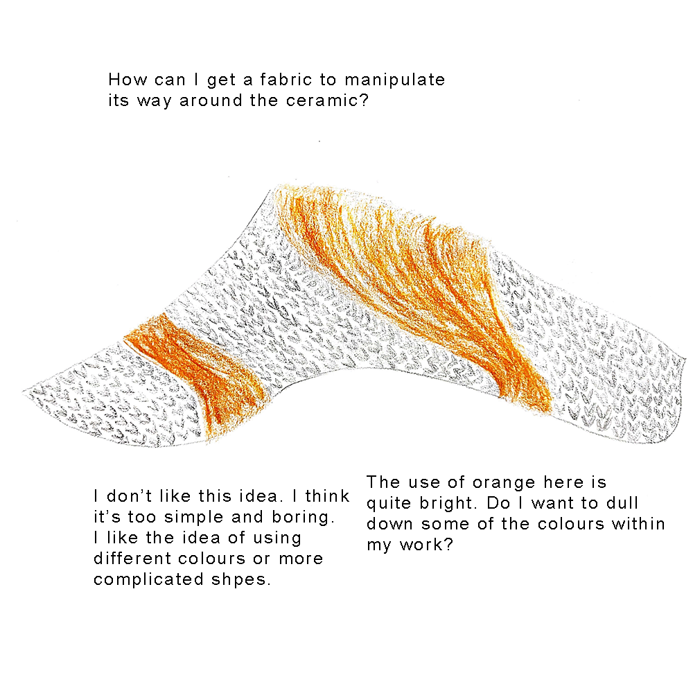
In response to this research and thinking about themes of feminism and women that I have found in relation to knitting, I sketched some designs. I found that red, blue and green were recurring colours throughout the work. The second and fifth sketches are heavily inspired by the idea of embrace, where I found that I really liked the idea of the fabric embracing and hugging around the ceramic.
1
2
3
4
5
6
7
Colour Research
Thinking about femininity and how that relates to my work, I wanted to research how colour is associated with gender. The colours pink and blue have been associated with girls and boys respectively, within clothes, toys and other objects. This gravitation towards these colours can often be since birth, with childrens colours being especially prominent within baby clothes. Over time, advances in technology mean that the sex of a child is able to be determined before the child is born, this means that clothing, toys and bedding etc. can be bought with the child's sex in mind.
When looking into research across multiple nationalities, there was a clear trend where women were associated with the colours pink and red, whereas, the associated colours with masculinity were blues, blacks and browns. Darker colours were more associated with masculinity compared to lighter colours which were associated with femininity.
Sources: Pink and Blue : Telling the Boys from the Girls in America, Jo B Paoletti
Colour associations for the words feminine and masculine in nine different countries, Ivar Junga and Yulia A. Griberb
https://www.pantone.com/uk/en/articles/color-news/the-evolution-of-pink
Angela Tait
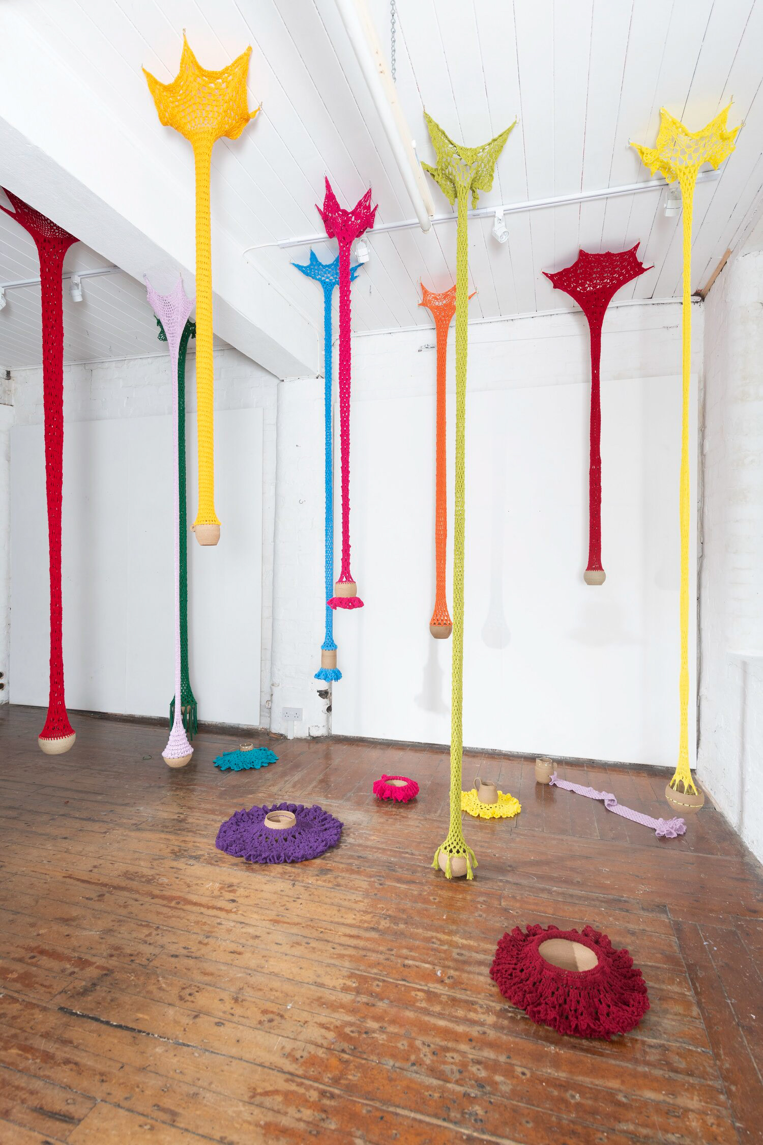
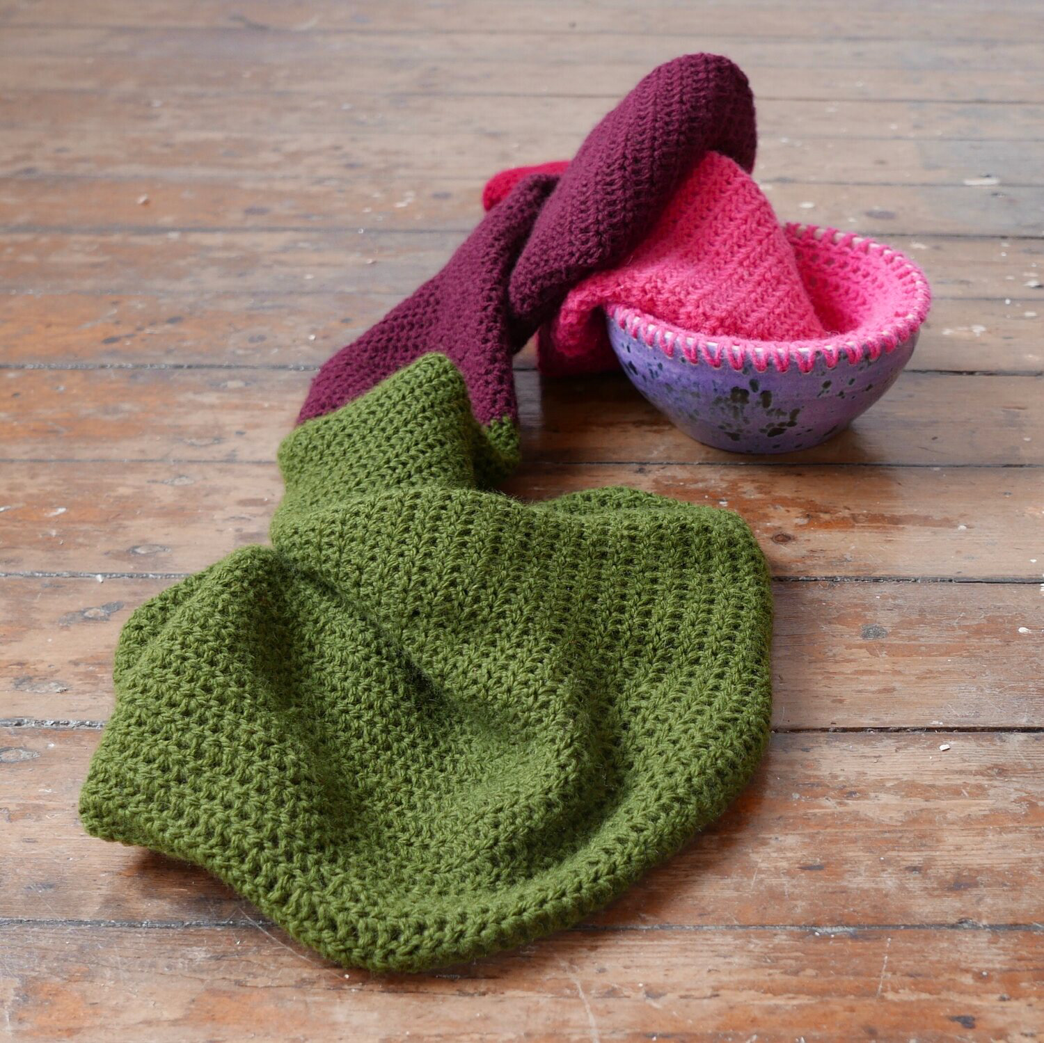
Researching Angela Tait's work, I am amazed by the different uses of tension within the work, but also the different scales she is capable of. The use of colour is noticeable but I think it would be interesting to know why she chose the colours she did for each piece of work. The texture of the crochet mixed with the smoothness of the thrown clay creates a contrast and you can see both clearly. When thinking about my own practice, I think about how much textiles is being used, do I have a hierarchy when it comes to both textiles and ceramics and do I prioritise one over the other?
Sarah Lucas
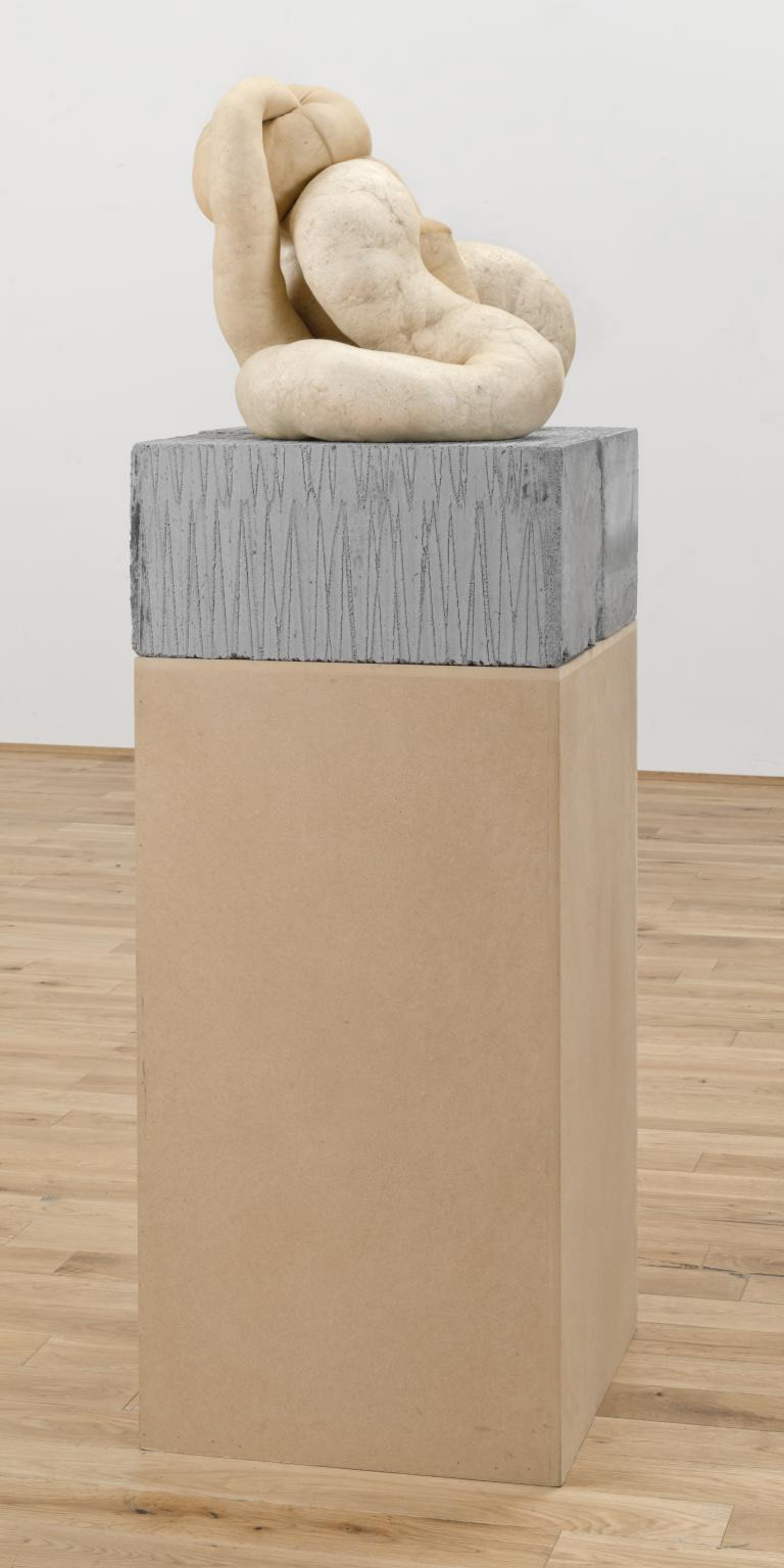
Lucas' use of tights and stuffing creates these marble line sculptures that stand by themselves. Her use of forms create a piece that looks like it could be made by one component or multiple components. I think the colour is the most intriguing aspect, with this orange underflow that becomes more or less noticeable when there is more or less stuffing used within the tights.
Connecting this to my practice, it might be interesting to see how I could knit on a larger scale without casting it, utilising the properties of a more flexible knit is something that I would like to try within this project.
Ferne Jacobs
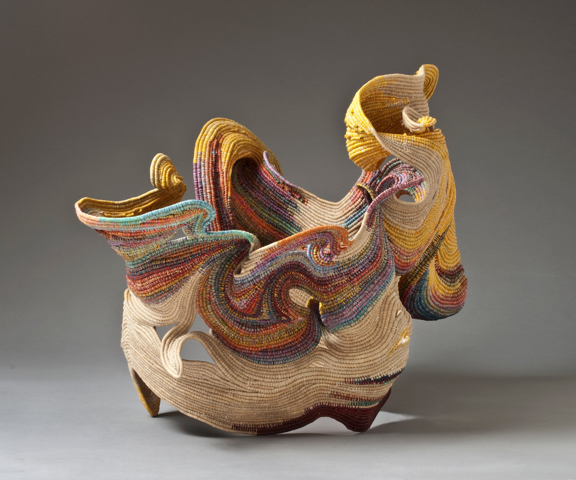
These forms look almost 3D printed, each layer being accentuated by the process it is made of, waxing and twining the linen. These works flow and have intricacies that are shown through the layers. I find that using minimal colour does not affect my admiration for the shape, making me wonder whether having lots of colour within a piece is necessary when it comes to textile art. Compared to my work, my solid and less malleable work is made from ceramic, however, here Jacobs is using wax to solidify the material without affecting its look too much.
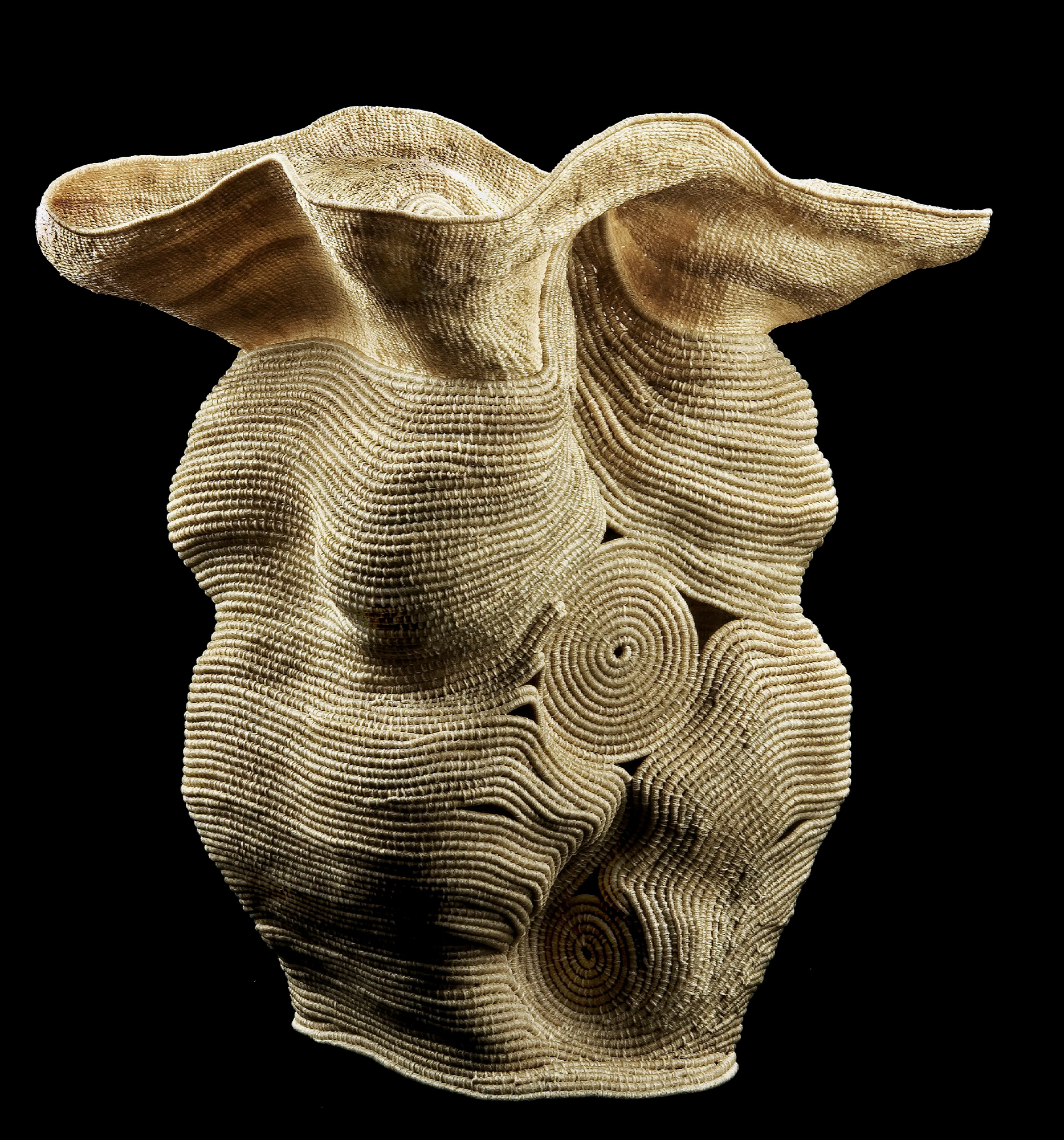
Looking at the artists I am researching, I see that a lot of them use textiles as their main material within their practice and utilises its strength and flexibility. I am currently thinking that using a mix of machine knitted and hand knitted material will elevate my work but also allow my work to be created on a larger scale.
CJ Tutorial Week 4
After my tutorial with CJ, I wanted to look at how you could mark make and signpost using textiles and other materials. As my work is leaning more towards me reacting to my surroundings, I researched work where I felt the word 'reaction' fits within the theme.
Celia Pym
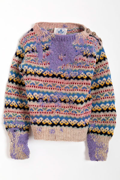
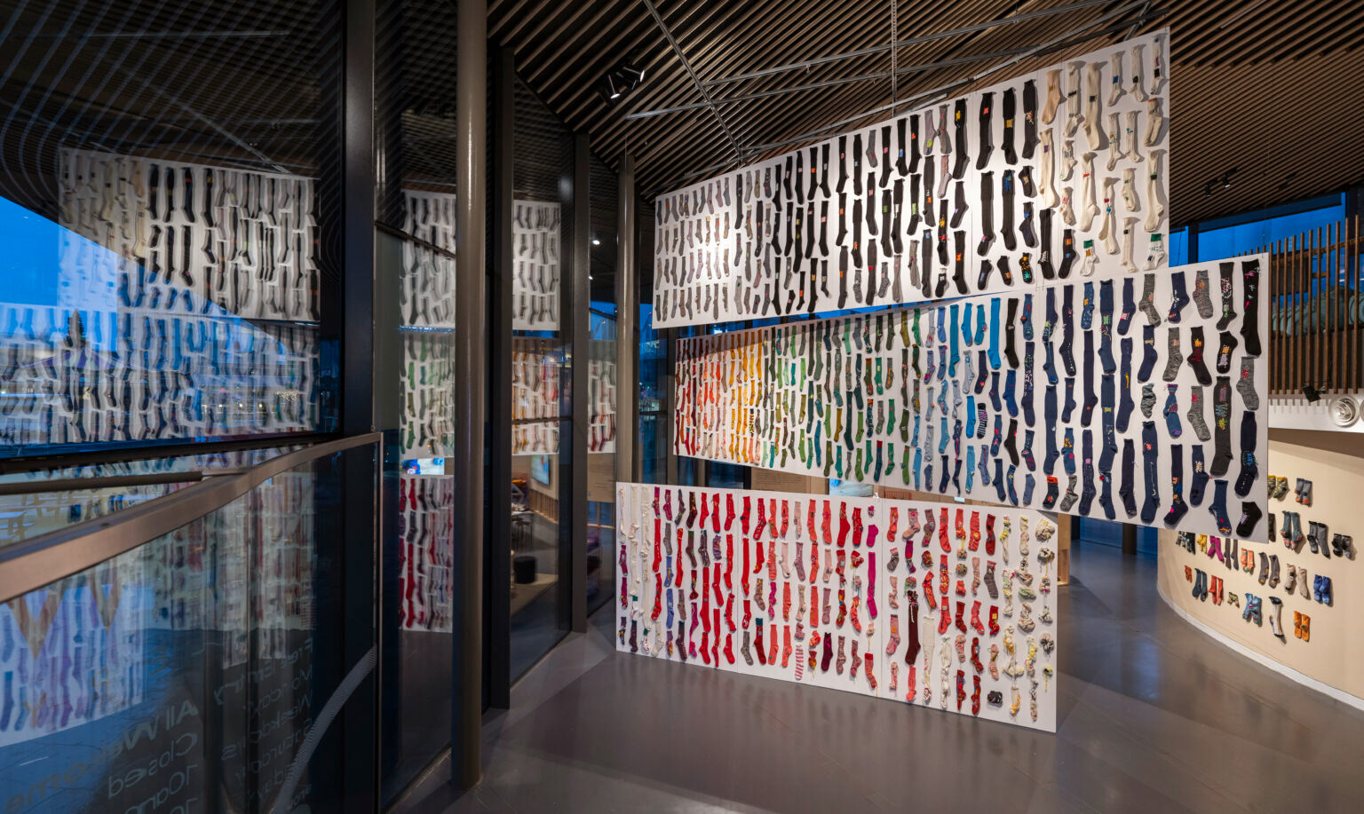
Celia Pym's work consists of mended objects, mainly textiles, and often holds a narrative. Within her book 'On Mending', Pym mends garments that have been damaged over time and visibly mends them to create loose patterns and shapes all over the textiles. Sometimes patterns within the garments are paused to allow an often bright colour to disrupt it while also mending the garment. Pym's exhibition, SOCKS: the art of care and repair in the NOW Gallery consists of socks that have been darned by school students during workshops that Pym has facilitated. This paired with repairs and mends that she has also done, creates an immense number of upcycled garments that have been recycled to create art. Pym's work fits within the theme of 'react' due to her mending and reacting to the damage worn over time. It would be interesting to know why she has used some of the colours she has, especially for 'Hopes Sweater' (shown to the right) where the colour clashes with the other bright colours within the sweater. What I like about Pym's work is the organic shapes that are created, these due to her reacting to the wear and tear of the garment.
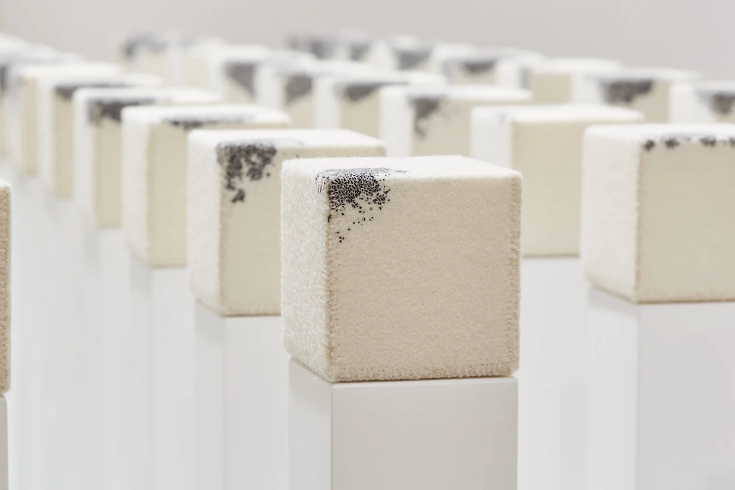
Richard McVetis
Richard McVetis' work consists mainly of textiles, including hand embroidery. Mainly using a monochrome colour scheme, his work focuses on time. Creating intricate stitches and showing skill and patience. His work 'Variations Of A Stitched Cube' shows the time he spent on each cube, embroidering the same cube over and over but with slight variations to show the difference in time of stitching and time spent stitching. The use of the shape of a cube allows for stitching to be shown on a 3D form, instead of 2D, using the cube creates a space for the audience to look all around and see the work almost grow from the corner. The cubes create a 3D canvas and this is something to think about as I will be creating objects/installation art that will be viewed.
A Fieldwork Story Told Through Knitting by Mahardhika Sjamsoe’oed Sadjad (from Feminist Methodologies : Experiments, Collaborations and Reflections)
Within this chapter of the book, Sadjad writes about her experience knitting in Indonesia when going there for research for her PhD. Wrestling with thoughts concerning her work and life, and trying to balance the two, Sadjad writes about how integrating her thoughts into her knitting helped her make sense of them, while invoking a sense of calm. Dividing the chapters with titles such as 'Casting On' and 'Crossing Needles, Carrying Yarn', showed the journey that she took throughout her research and how the knitting followed through with her. Sadjad used different colours within the scarf that she knitted throughout her time in Indonesia, using different colours for different emotions and writing her thoughts alongside them. This made me reflect on why I do knitting, the meditative and calming effect it has on me and how I could potentially show this within an installation or object.
Source: Harcourt, W, van, DBK, Dupuis, C, & Gaybor, J (eds) 2022, Feminist Methodologies : Experiments, Collaborations and Reflections, Springer International Publishing AG, Cham. Available from: ProQuest Ebook Central. (Accessed on: 24th February 2025).
Mihaly Csikszentmihalyi
Csikszentmihalyi's theory of a state of 'flow' is the continuous and intense concentration that is 'fallen into' when one is engaged within an activity. This is not forced in any way and is achieved when engaging in an activity, for example, painting, construction, sport or craft. Csikszentmihalyi partly blames television for the decrease in concentration across the population, and says it is harder to achieve flow due to the lack of engagement and the passive relaxation that comes with watching television. Csikszentmihalyi's work started with a study into the creativity of painters, when interviewing the painters at different points throughout the painting instead of after the painting is finished, he found that the interviews were more focussed on the process of the painting rather than the end result. When it comes to my own practice, I find that I do achieve a state of flow while I am knitting. I enjoy the process and I do think that the repetitiveness could add to that flow state. I think that keeping notes and checking in with my thoughts throughout a knitting session could be a way to figure out how I achieve the state of flow within my knitting. Choosing points to stop at could also inform where I place any ceramic pieces within my work.
Sources: https://www.nytimes.com/2021/10/27/science/mihaly-csikszentmihalyi-dead.html
Review of Flow: The Psychology of Optimal Experience by Mihaly Csikszentmihalyi reviewed by Richard Buchanan in Design Issues, Vol. 8, No. 1 (Autumn, 1991), pp. 80-81.
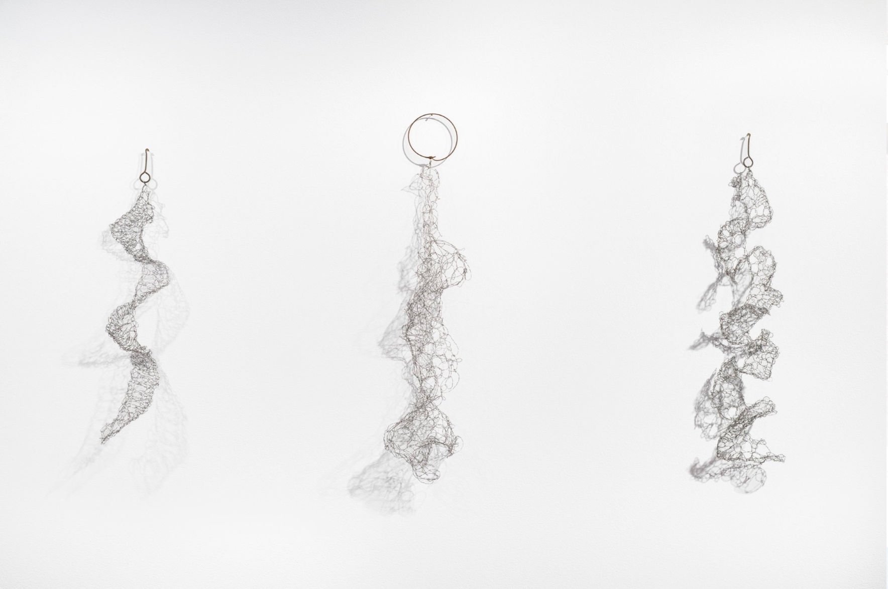
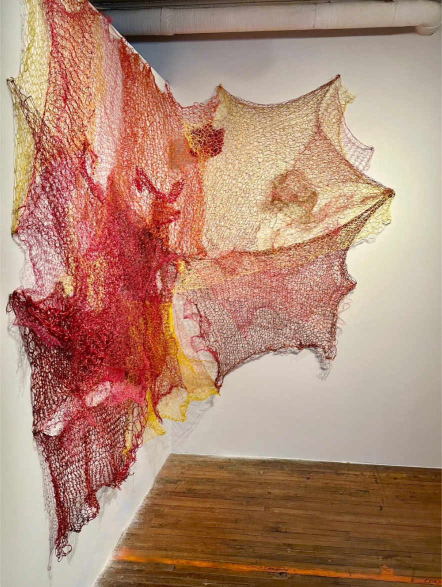
Carolyn Halliday
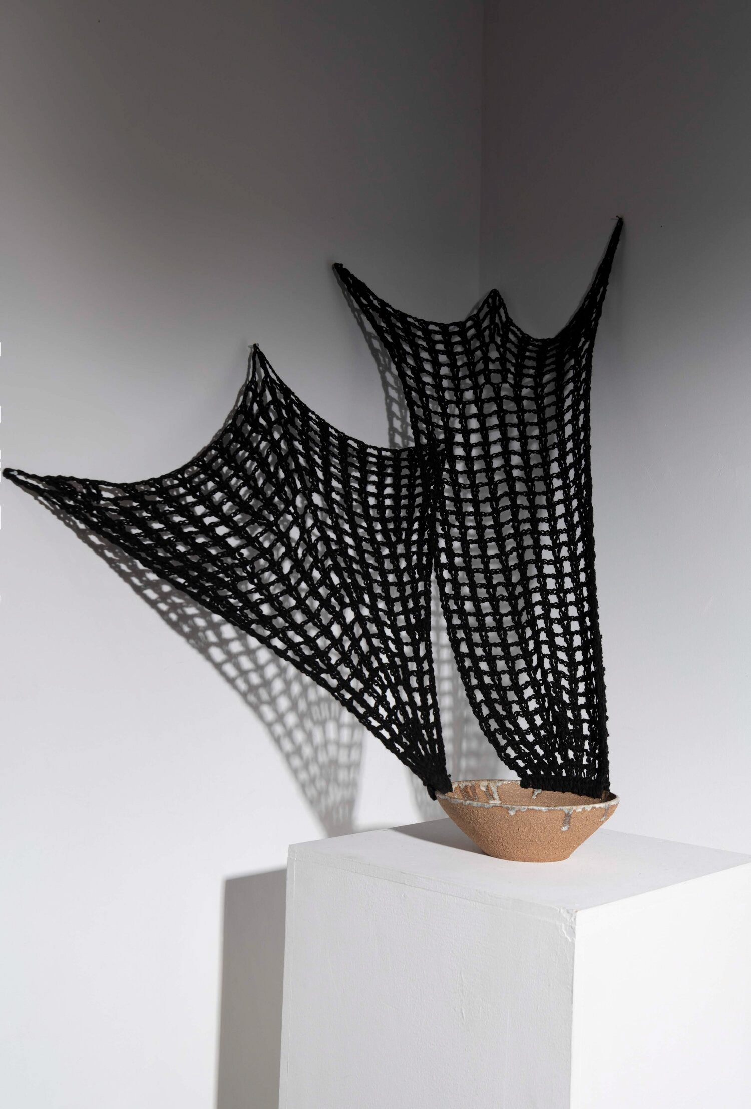
Halliday's work consists of knit and crocheted materials that range from textile to metal. Her two pieces of work are taken from her exhibition called 'Making Climate Change Visible'. I am interested in the curation of these pieces, with the first artwork being put on the corner of the wall. The second artwork that is hanging on the wall shows the shadows really well and it could be interesting to see if my work could potentially look different based on angle or placement. I will start thinking about presentation of work within the design process and how my work could be presented as this will be a major part of the work.
Collect 2025
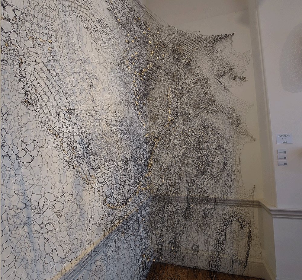
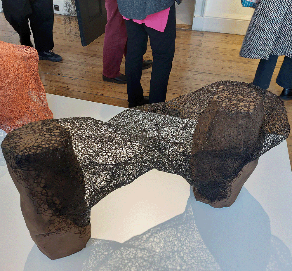
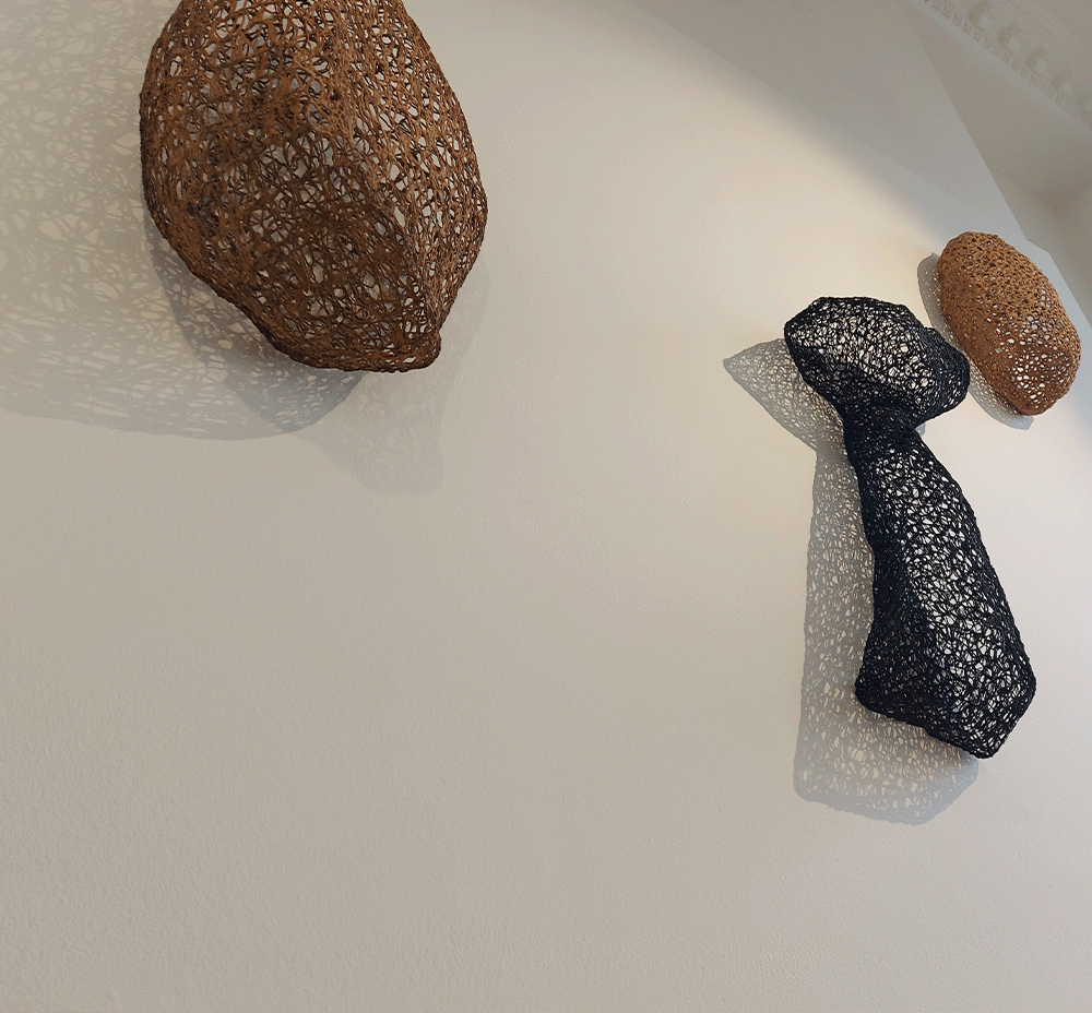
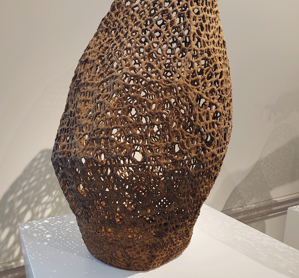
I really liked how Kyeok Kim's work was curated. Her different pieces of work were shown at different angles, almost sectioned off, but presented in different ways. Her large scale art shown in the corner of the room, taking up that space, but also leaving room for people to walk up close. Her large scale items that interact with wooden objects are shown from below, giving the viewer a chance to see the shadows that the lace effect can make. Above are hanging objects laid flat against the wall where you can also see the shadows. Then standing objects are shown on a plinth and you can also see this singular object up close. Making different objects and putting them in different spaces meant I was able to easily compare them. There was an over running theme of connection throughout the space where all the different forms interacted with the space differently. Within my own practice, I should think about how two pieces of work could be compared within a space, how will each interact with the space and potentially each other?
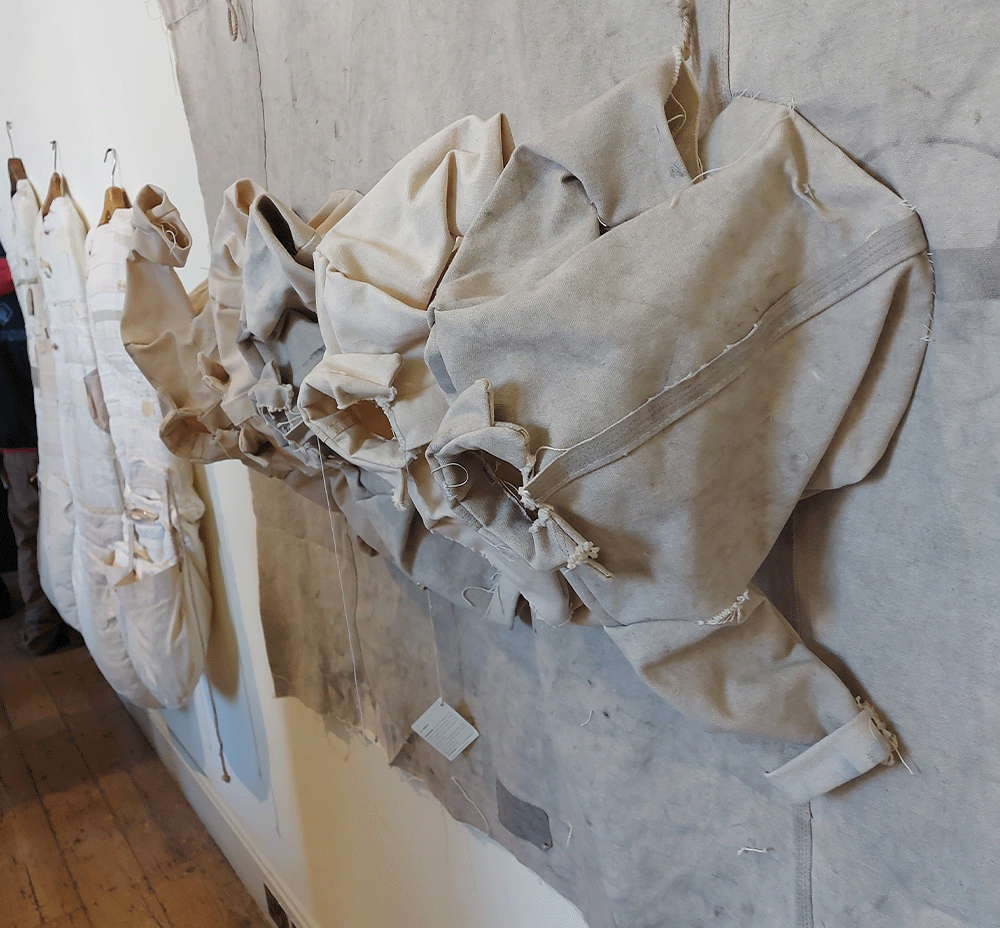
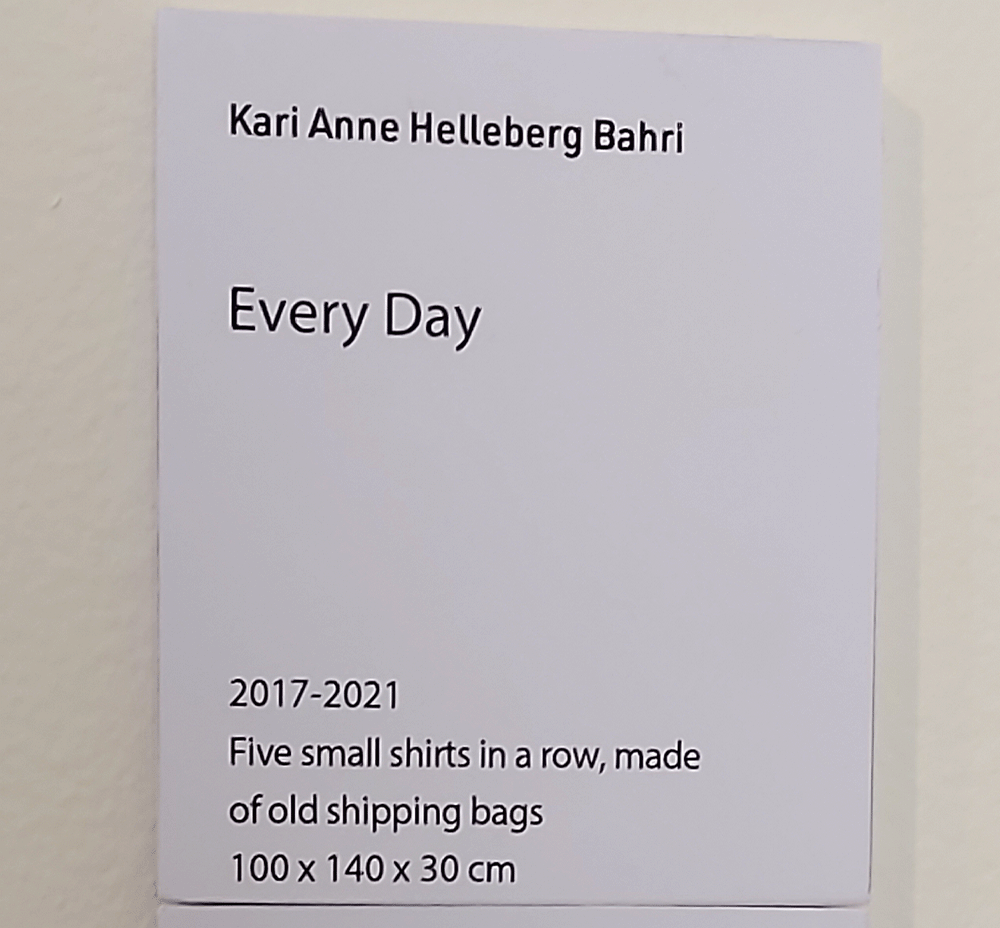
The theme of repetition within this work is clear. Instead of just talking about the materials used, the text beside the work gives a small description of what the work is without any context. When researching the work, I found that the meaning of the five shirts is to represent the working week and the normalisation of a 'working week' within society. I find that having a description of the piece could add to the thoughts the viewer is having, why are the shirts small? why use old shipping bags instead of new?
Using the old shipping bags gives a slight variation from colour to colour. Thinking about the potential of using repetition within my work, this example shows how the use of detail can help the viewer compare each object independently while also seeing it as part of a group.
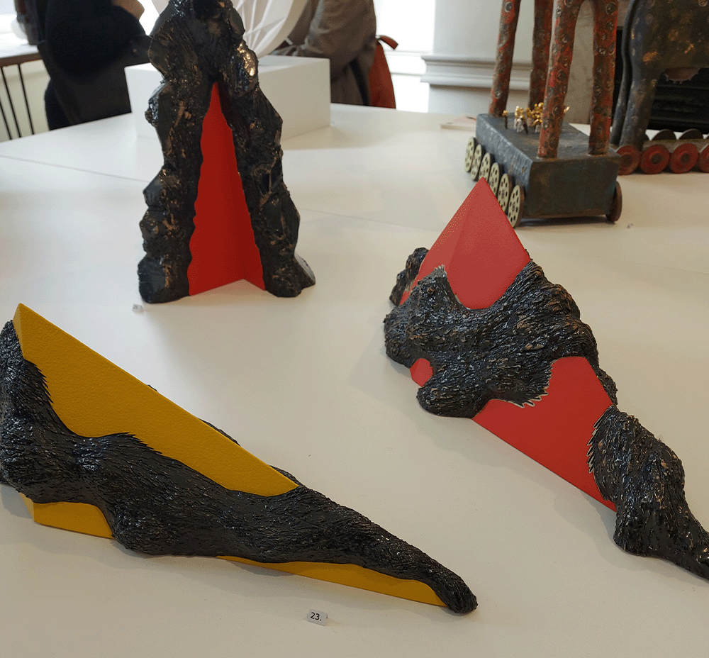
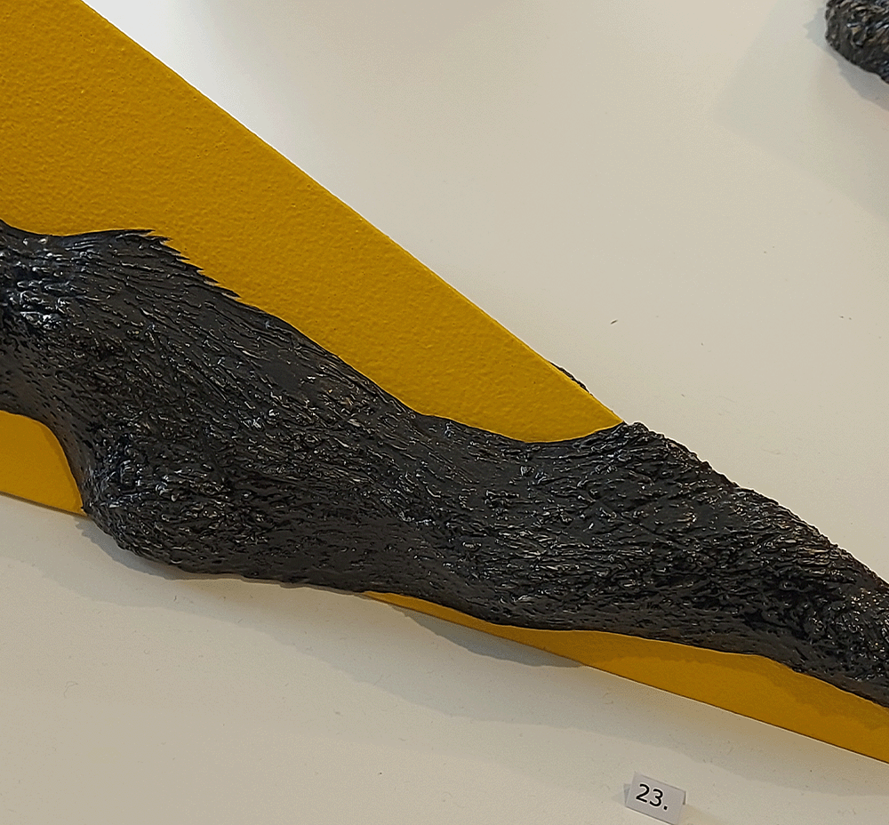
Jane King uses ceramic, earthenware glaze and acrylic to create work that uses a metallic looking mix of two materials but are actually showing the duality of the ceramic. Thinking about how I show knitted textiles in two ways within my work, I was inspired by the boldness of the shape and texture, as well as the colours used. It would of been interesting to see how the work would've looked hung up as well as stood on the table. When thinking about the contrast of texture and how I use different fibres to show the difference between the ceramic and the knitted material, could colour emphasise the ceramic or the texture of the knit?
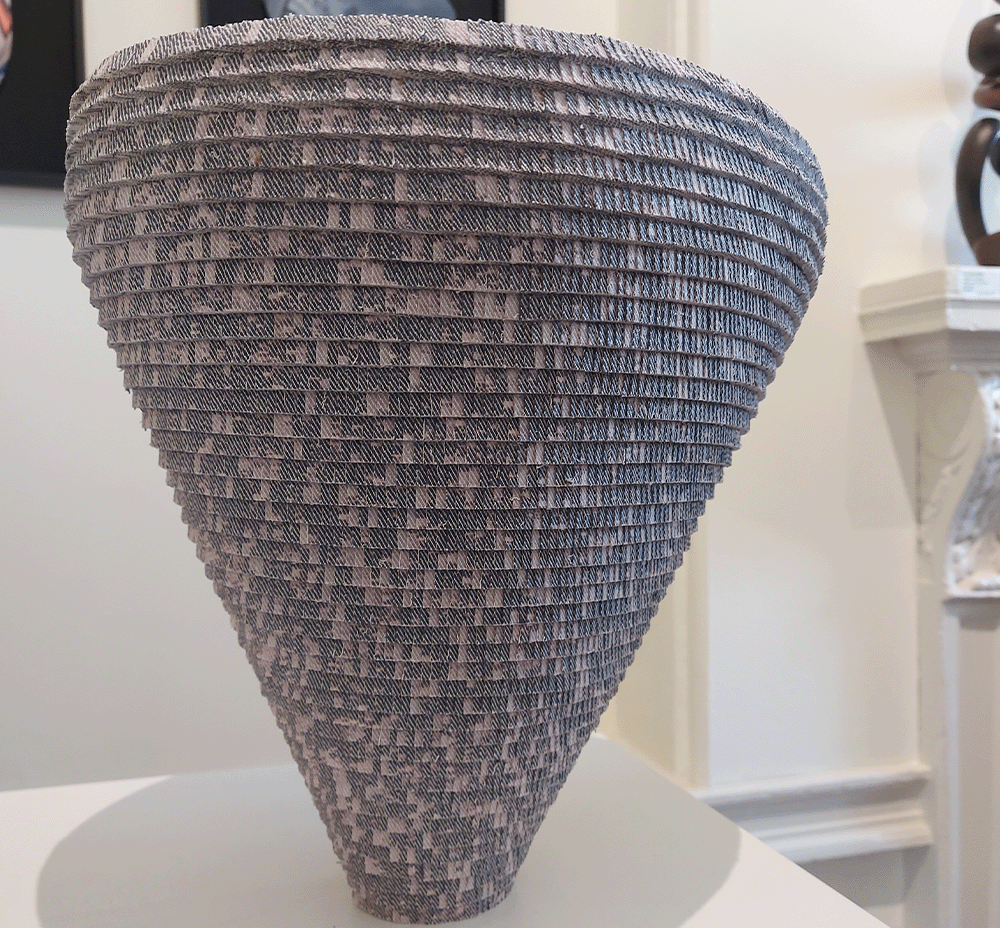
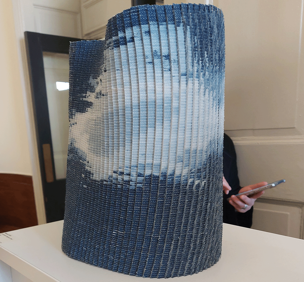
A key inspiration from these denim objects by Minyeol Cho is the use of form. Using such small pieces of denim to build up the shapes shows the time that it has taken but also the strength of the textile. The layering of the pieces and the use of repeating square reminds me of knitting stitches coming together to create the shape.
Tension has been an overarching theme within my work over the course of the year. Using the solid ceramic to influence the way I tie a knitted shape around it to my experimentation with using ceramic as weights. I decided to research tension within objects, using the materials in a way that cause the viewers themselves to have tension and/or tension within objects.
Richard Serra
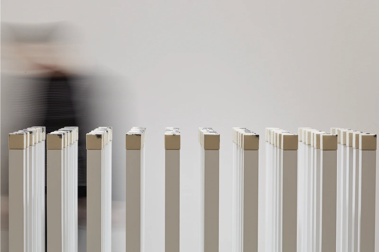
Serra's work plays with material and tension, creating large scale objects that can be taller than the viewer or smaller objects that interact with each other to create tension. The work to the right, called 'Shovel Plate Prop' plays on the tension between the two object but also the impermanence of these balanced objects. Two years before exhibiting this piece, he showed a 'Verb List' full of words that he described as "actions to relate to oneself, material, place, and process."
The word 'tension' is involved in Serra's list, saying 'of tension' instead of to be tense or similar. I think it is important to show this list as it is a way for Serra to verbalise his work and the process that goes into his pieces. I believe a lot of these words relate to my own process, seeing how the knitted material 'twists', 'curves', 'binds' etc. When Serra writes 'of gravity' he reminds the viewer of the use of gravity within art and how important it is to use gravity not only within the process but also to present the work.
In this exhibition, Serra focuses on his 'Prop' work, working at a larger scale, this era of his work came after his 'Splash' work where he worked with molten lead. Focussing on how these cylindrical and flat shapes come together, Serra uses gravity to create pieces that look as if they should be taped together but are not, using balance and tension.
Another way that Serra pushes the boundaries of his work is through short art films that he created, putting a spotlight on the material he uses. In the film 'Hand Catching Lead' is a 3 minute film of a hand trying to catch pieces of lead dropping from above. The use of gravity in the film leads me to believe that Serra is focusing on the role gravity plays within his work.
Sources: https://www.theguardian.com/artanddesign/2024/mar/27/richard-serra-obituary
https://www.artforum.com/features/due-process-richard-serras-early-splash-cast-works-226187/
https://www.dreamideamachine.com/?p=6889
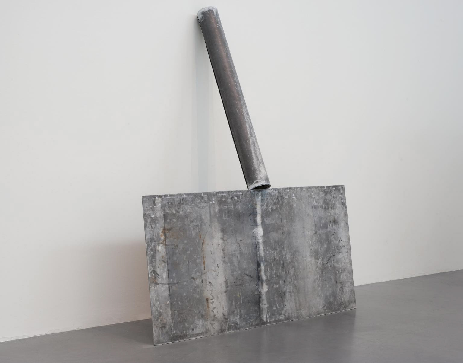
Richard Serra 'Shovel Plate Prop' 1969 from Tate Website
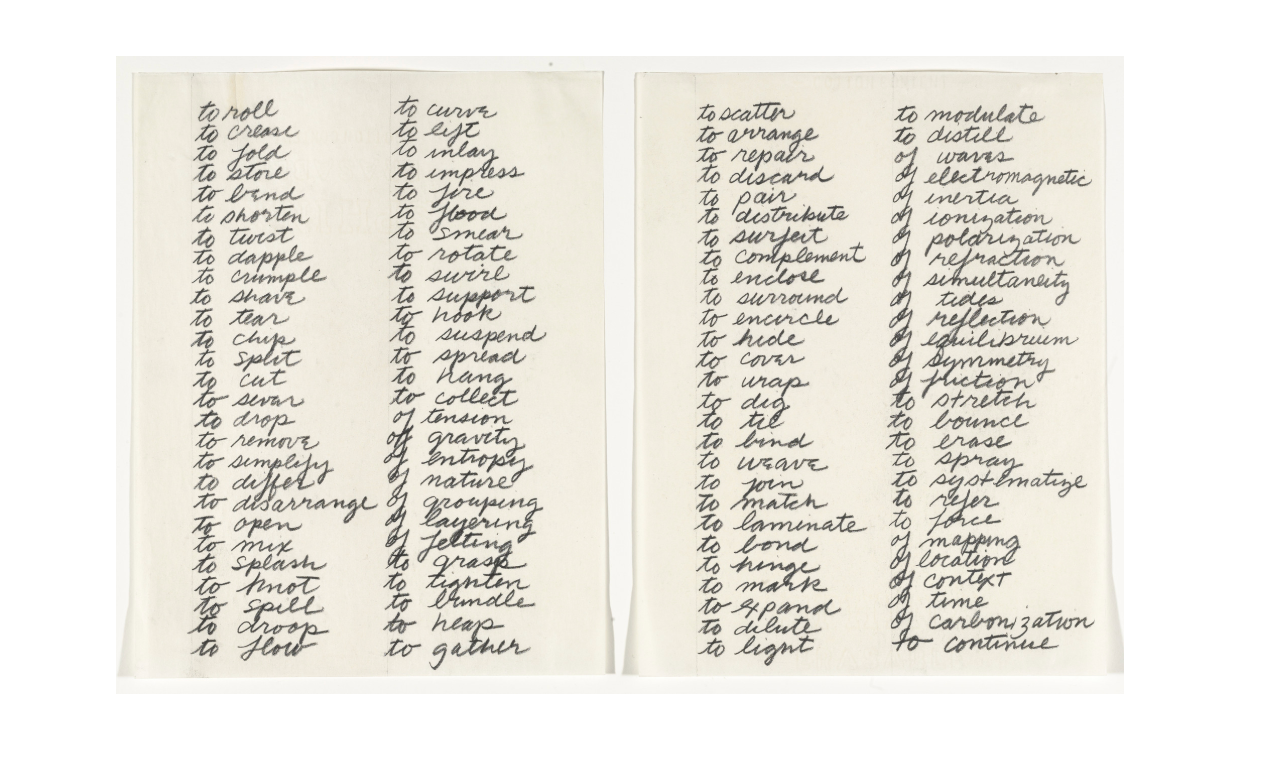
Richard Serra 'Verb List' 1967 from MoMa Website
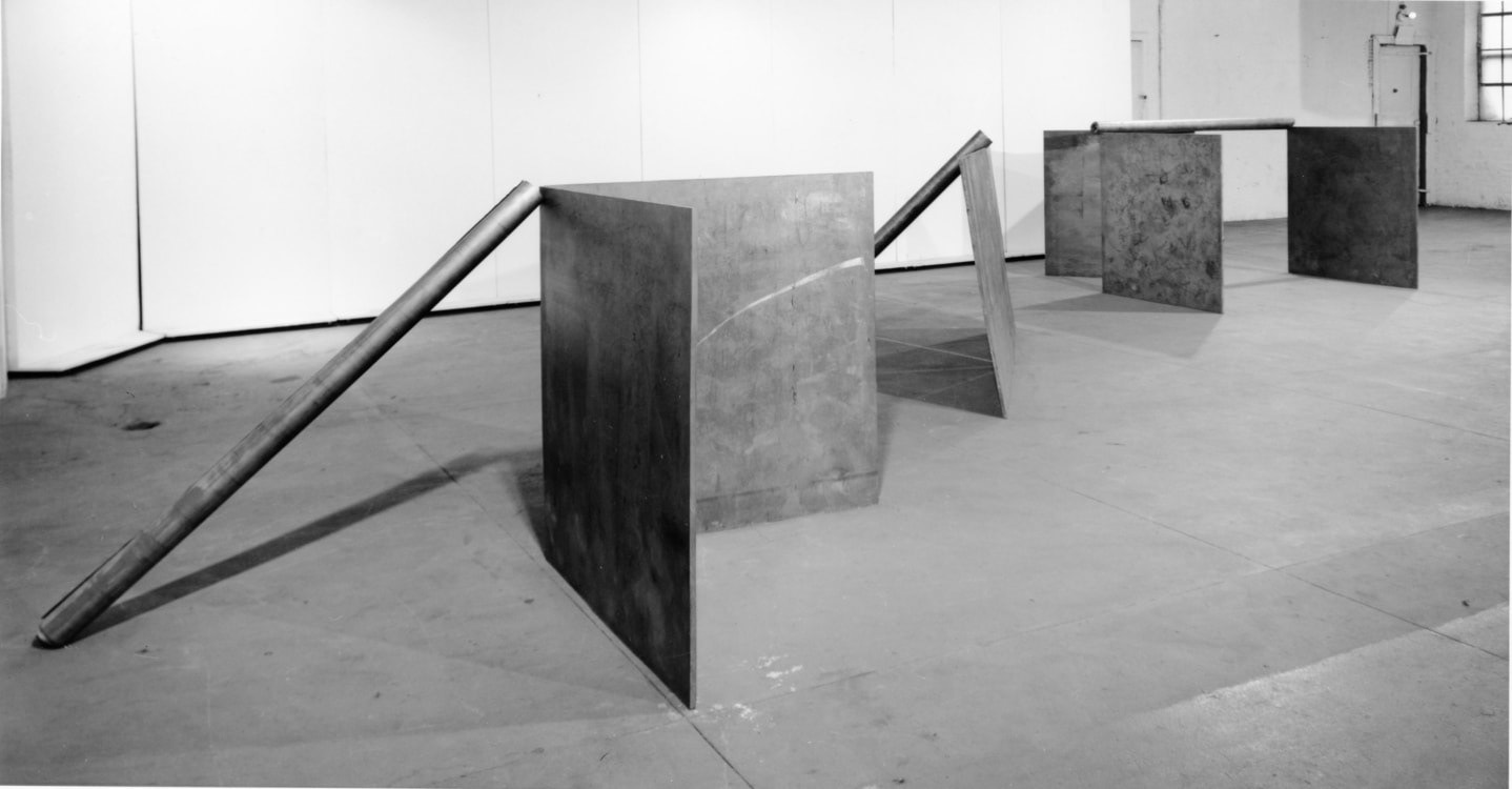
An Installation by Richard Serra December 16, 1969 – January 10, 1970 at Castelli Warehouse from Castelli Website
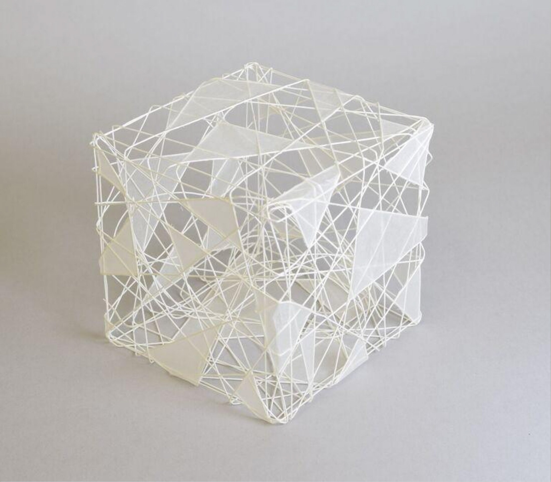
Cube 1994 Naomi Kobayashi from Tate Website
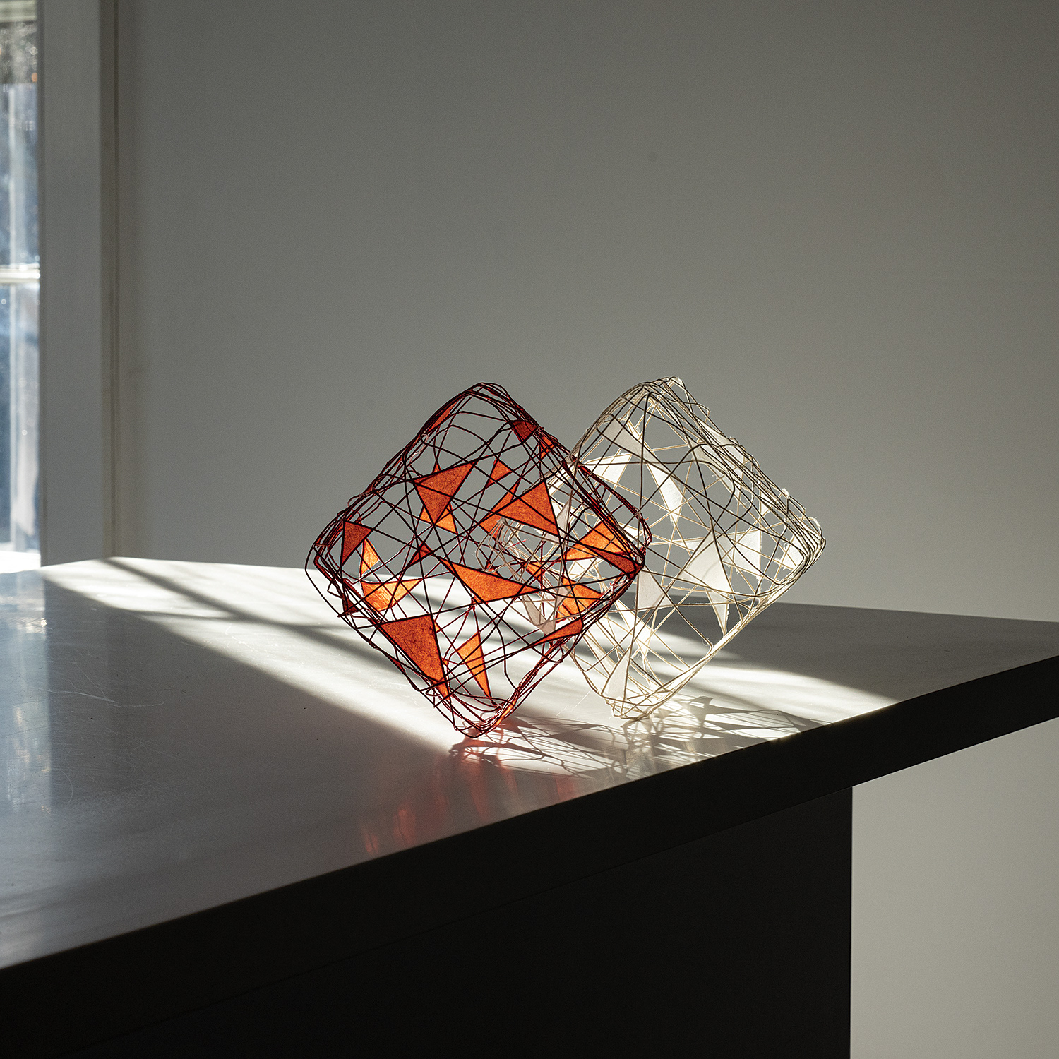
Cubic Harmony 3 (1995-1996) Naomi Kobayashi from Browngotta Arts website
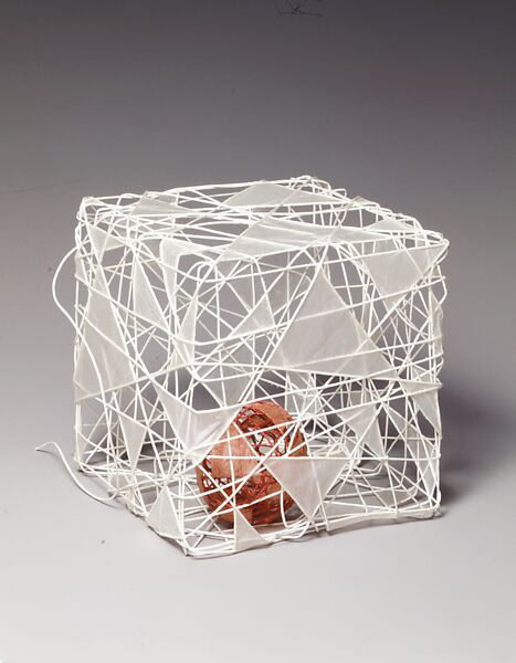
A Drop of Cosmos '95-2 Naomi Kobayashi from Met Museum Website
Naomi Kobayashi
Kobayashi's work uses a mix of washi paper and string to create cube and cuboid shapes that consist of a pix of paper triangles and string that is wrapped in a cube shape but is hardened with glue to create a static shape with the string. Koboyashi's work uses tension to create a hollow shape full of holes and paper that is used to connect multiple threads.
The threads throughout the pieces consist of a mix of straight and curved shaping throughout the 3D shapes. Even within the third piece, there is a more spherical piece that consists of the same technique used for the squares. The way that the artists creates these shapes to interact with each other makes the viewer question how these pieces can intersect or be held inside each other.
The way that each of these pieces are presented are very different, with the different lighting affecting how each piece is shown. Personally I think the use of sunlight within the second photo accentuates the material's transparency and the shapes that they make.
SourcesL https://browngrotta.com/artists/naomi-kobayashi
https://www.metmuseum.org/art/collection/search/486971
https://collections.vam.ac.uk/item/O456730/cube-1994-fibrework-and-storage-kobayashi-naomi/
Continuing my Research into Meanings of Colour
Wanting to evoke the relaxing feelings that I feel when both hand knitting and machine knitting. Most sources have cited that blue is related to relaxation and calmness, with the others talking about the use of blue as a more sombre colour, with the saying of 'feeling blue' meaning to feel sad. A study run by G.F. Smith (a paper company) and the University of Sussex found that navy blue provoked the word 'relax' within respondents to the survey. Within some sources, the colour blue was associated with the ocean, a space that is thought to be calm, with water based spaces being used as 'blue therapy'. Blue has been used within my models so far but I would like to incorporate a mix of navy blue and mid-light blue to invoke a sense of repetition within my work. If I kept it a mix of cream and navy blue, I would find that the work would be too contrasted and not as calm or relaxing, I would like to use a mix of blue colours that are repeated throughout the piece.
Sources used: O'Connor, Z. (2011) 'Colour psychology and colour therapy: Caveat emptor', Colour: Research and Application, 36(3), pp. 229-234. Available at:
Lubos, L. (2012) 'The Role of Colours in Stress Reduction', Liceo Journal of Higher Education Research, 5(2), pp. 95-103. Available at: http://dx.doi.org/10.7828/ljher.v5i2.39
Bruneman, H. (2023) Research shows navy blue is the most relaxing color in the world, Better Homes & Gardens. Available at: https://www.bhg.com/news/navy-blue-relaxing-color/#:~:text=The%20University%20of%20Sussex%20and,relaxing%20color%20in%20the%20world. (Accessed: 21 March 2025).
Latham, F.A. and K. (2022) The surprising benefits of Blue Spaces, BBC Future. Available at: https://www.bbc.co.uk/future/article/20221108-the-doctors-prescribing-blue-therapy (Accessed: 21 March 2025).